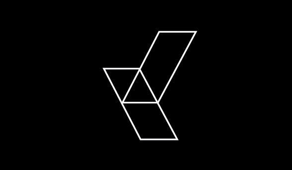

This is from using our new logo as a template for glyphs in a typeface. This isn't something a corporation would use as a font, maybe in the future, but is something I may develop as a self-initiated project in the future.
 see...not very corporate like
the letters look like they are resting on a table this type face should be placed on front of the small book of crayon logos. If the corners were rounded. The typeface can take two or three forms possibly? an evolution of a corporation, this is what we want to become.
ReplyDeletei think this relay dose sute the logo better than din though.
ReplyDelete