Saturday 28 February 2009
houseing animataion
hi just thought i would upload the animation i did a while back sorry for the delay.


Poster Idea
 Quite difficult to decide on the number of houses but the idea of repetition and how an object or image can be completely changed through being multiplied to a greater proportion.
 Ordered and efficient.
Question:
Do we want to have a set colour for the company?
Thursday 26 February 2009
poster ideas


Poster ideas for Mondays screen printing poster shows a date which could be a date Novus opens for applications or another key date.
logo experiment

this is the novus typeface and logo combined then the colours inverted just wonted to show every one as i thought it was a interesting look.


Wednesday 25 February 2009

Tuesday 24 February 2009
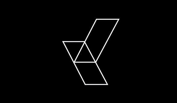
Logo Development
An extension of the Logo and Motorway junction idea and how its is rendered 3d. We could think about changing the angles to be more obtruse (i think) or wider more like 120 degress for example.
Vinyl Logo

Having a play with electrical tape can create an idea that is more physical. Look at the scale of the logo compared to oli its as if you can climb into the 'window' of Novus through its logo. From the grid structure we could look at land shapes and architecture, and possibly render more physical shaped from the logo for experimentation.
Logo Landscapes
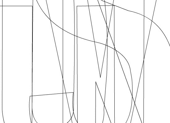
Just a few small thoughts about the Logo and how it can be monumental, the way it can be represented as a structure. What i find interesting is the inconspicuous 'N' within the structure of the logo itself. sorry was trying a peter saville typeface. Maybe the anlges can be altered so they arent 45 to 90 degress like an isometric grid.
TYPE NOVUS IN AND HIT ENTER

This is from using our new logo as a template for glyphs in a typeface. This isn't something a corporation would use as a font, maybe in the future, but is something I may develop as a self-initiated project in the future.
 see...not very corporate like


Sunday 22 February 2009
Video ideas
I got left in the Peter Coffin exhibition at work for too long the other day, and came out feeling really disorientated and a bit drunk. You guys were talking about a video for the final piece. I think with video, content is only half of the concern. How its presented can really make people engage and interact with it more, and therefore have a much more profound and lasting effect on them.


Friday 20 February 2009


Wednesday 18 February 2009

Tuesday 17 February 2009
identification system ideas
 the idea for my image based identification system for our country i have explored ways in which you can add and read information to a set shape/system i have come up with this idea of having 10 rows of 8 dots that can show peoples date of birth and more.
 this is a example of how it can be done (not a final idea at all yet) the red line shows Alex's date of birth the way it works is imagine each row has a number at the top of it with 0 at the top and so on until you get to 9 so reading from the inside go to each dot further out until you have the numbers for example it reads the 26/01/1988.
the other things i have looked at are rank and job so say that the creative industry is symbolised by the color blue and your job and rank are shown with a circle it would mean Alex is at the top or bottom of his field by the fact that it is on the outside ring.
the flower in the middle is a idea of how to show which Continent he was originally from i chose flowers as i thought it was a better solution that just using the shape of the Continent. for example...

and the Filed in section could mean how many children that person has in there family or another statistic and lots of other statistics could be easily slotted in to this chart.
Focusing on your future.
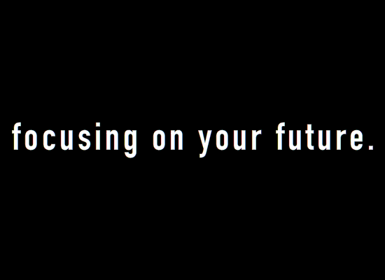
Have started thinking about the brand slogan of NOVUS, whether this is outspoken, or a mini-synopsis of the manifesto, I came up with "Focusing on your future" because they want to be seen as for the people, for the future and all of this as the companys priority. After watching "The Corporation", the bottom line is always about profit, but this isn't what NOVUS want to project, so wanted to do something to play on the idea of surface value and hidden meaning in things
I started with some wordplay of this slogan idea, and made this short typographic animation.
QR Code
 Although initially used for tracking parts in vehicle manufacturing, QR Codes are now used in a much broader context, including both commercial tracking applications and convenience-oriented applications aimed at mobile phone users (known as mobile tagging). QR Codes storing addresses and URLs may appear in magazines, on signs, buses, business cards or just about any object that users might need information about. Users with a camera phone equipped with the correct reader software can scan the image of the QR Code causing the phone's browser to launch and redirect to the programmed URL. This act of linking from physical world objects is known as a hardlink or physical world hyperlinks. Users can also generate and print their own QR Code for others to scan and use by visiting one of several free QR Code generating sites.
just wonted to show every one some more image based identification systems also isn't it interesting about the mobile phone software?
Sunday 15 February 2009


The Corporation film

Just watched "The Corporation"...seriously amazing documentary and so much to do with our project. The image above is a still from the film.

Abstract infographics


I've been having alot of fun messing around with this aesthetic, and the impact of white and colour on black is striking, for me at least. I like the idea that the information this company present could be quite obscured, visually hard to decipher. Food companies often make the important information about their products less important in the packaging design, because people are less likely to buy something if it comes across as unhealthy, which often it is.
Friday 13 February 2009

Typeface/1960's Info Graphics

Thought the title on this set in a beautiful sort of bloc typeface...also love the whole use of colour and it sort of ties in with everything we're doing.
FAB
Subscribe to:
Posts (Atom)